
Improving decision accuracy by 36% with a high-clarity, data-driven dashboard experience
FireAI is an AI-powered B2B SaaS platform provides insights to support the decision making process.
FireAI provides an AI layer on top of business data, allowing teams to ask questions in natural language, generate instant reports, and visualize insights without technical skills.
MY ROLE
Responsible for research,
conceptualization, and design.
TEAM
Two product designer, Design lead
THE PROBELM
Everything seems important, so nothing feels important.
The platform already had a strong analytics engine but the dashboard UI wasn’t enabling quick insight extraction.
KPIs, charts and tables all competed for attention, with every widget having equal visual weight and implying equal importance.
Users struggled to form a mental map or reading pattern.
RESEARCH & DISCOVERY
#01 USAGE PATTERNS & BEHAVIORAL ANALYTICS
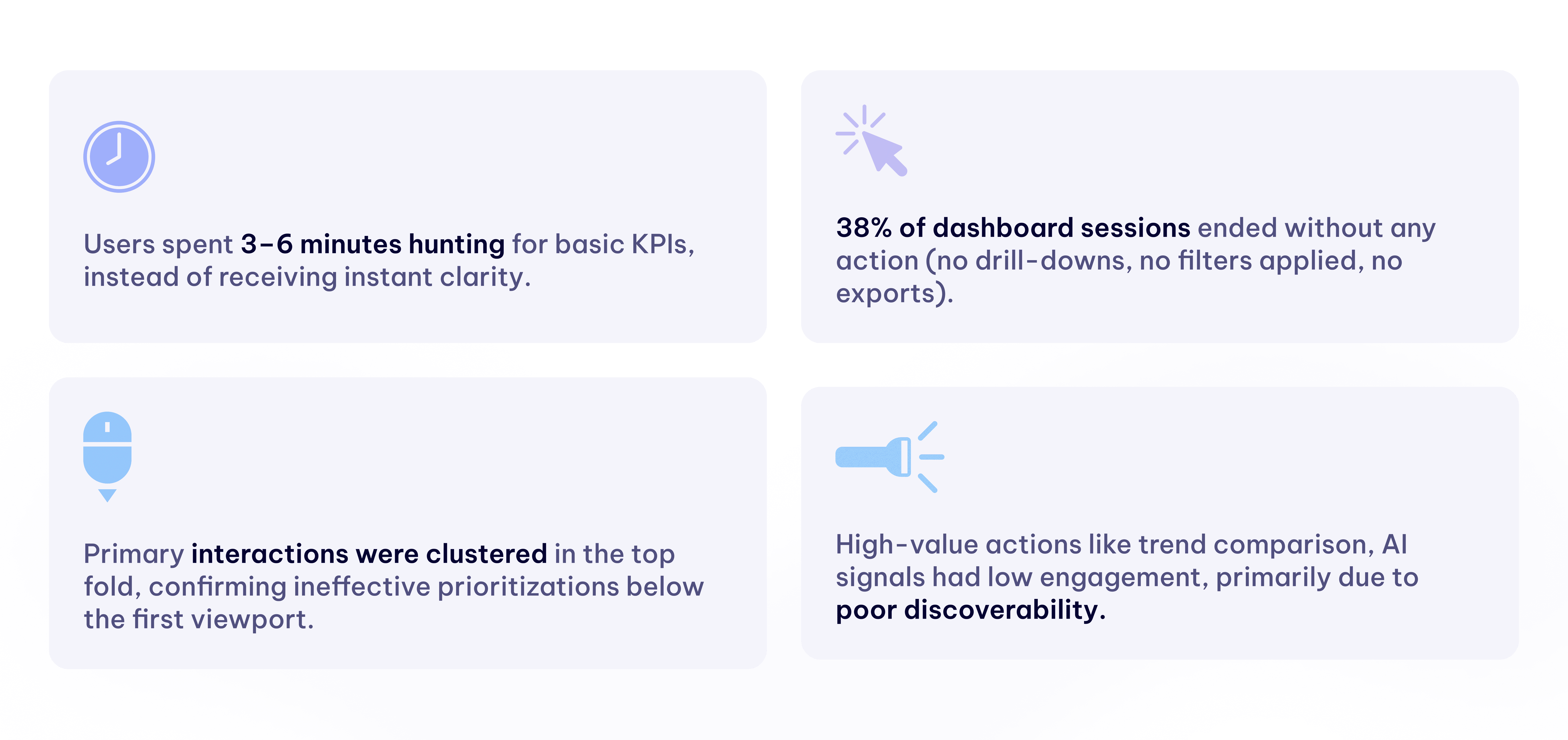
Users weren’t navigating with intent they were navigating out of necessity. The dashboard was overloaded but underperforming.
To ground the redesign in real behavior, We analyzed product analytics, heatmaps, and session recordings. The patterns were consistent and revealing. "Insights derived from Microsoft Clarity"
#02 CONVERSATIONS WITH USERS & STAKEHOLDERS
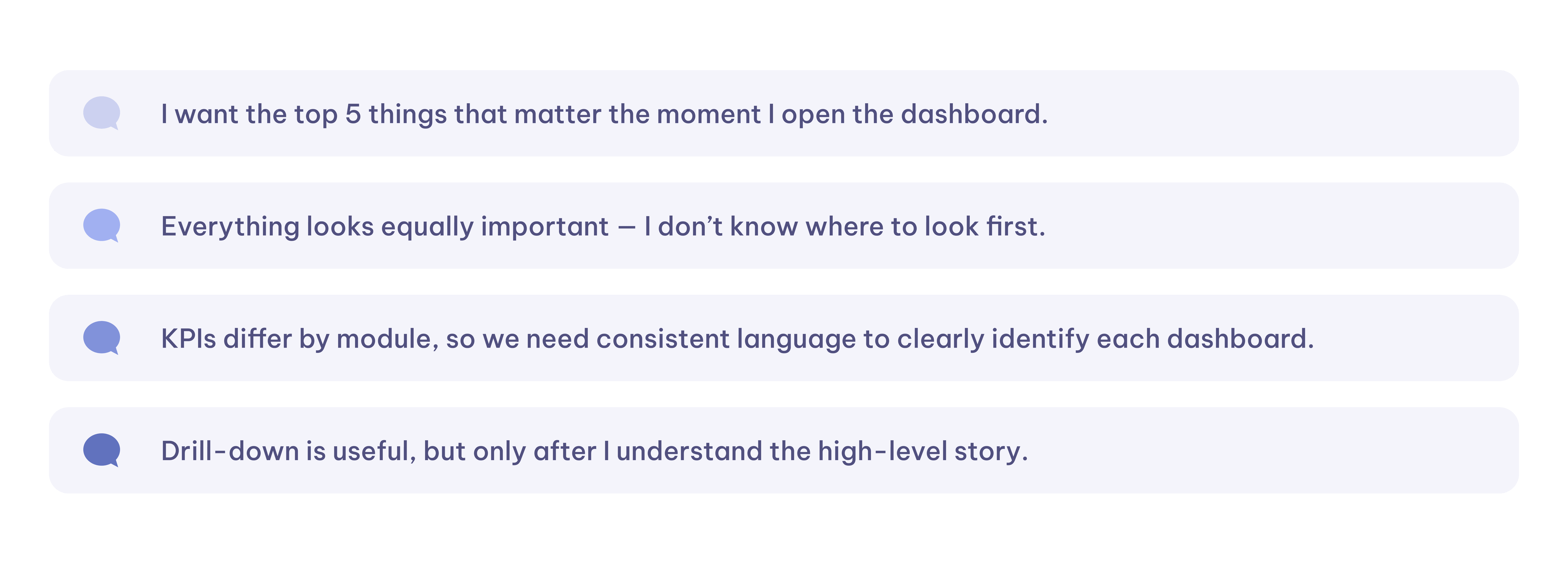
Users needed narrative flow, consistent KPI structure, and clarity. The design’s job was to lead them, not leave them to explore blindly.
We conducted informal discussions with frequent users: CXOs, operations heads, finance leaders, and internal analysts. Several themes surfaced across roles:
Root cause
Users couldn’t instantly understand what the dashboard wanted to say. Key insights were hidden behind visual noise and weak hierarchy.
THE GOAL
We wanted to align the dashboard with business visibility and efficiency outcomes
#01 Reduce time-to-insight through better visual hierarchy.
#02 Lower design/engineering overhead with a scalable modular system.
#03 Improve analytical depth by structuring data from overview to drill-down.
#04 Expand usability across stakeholders by enhancing clarity and accessibility.
THE FINAL EXPERIENCE
BEFORE
AFTER

SNEAK PEAK INTO THE NEW DASHBOARD
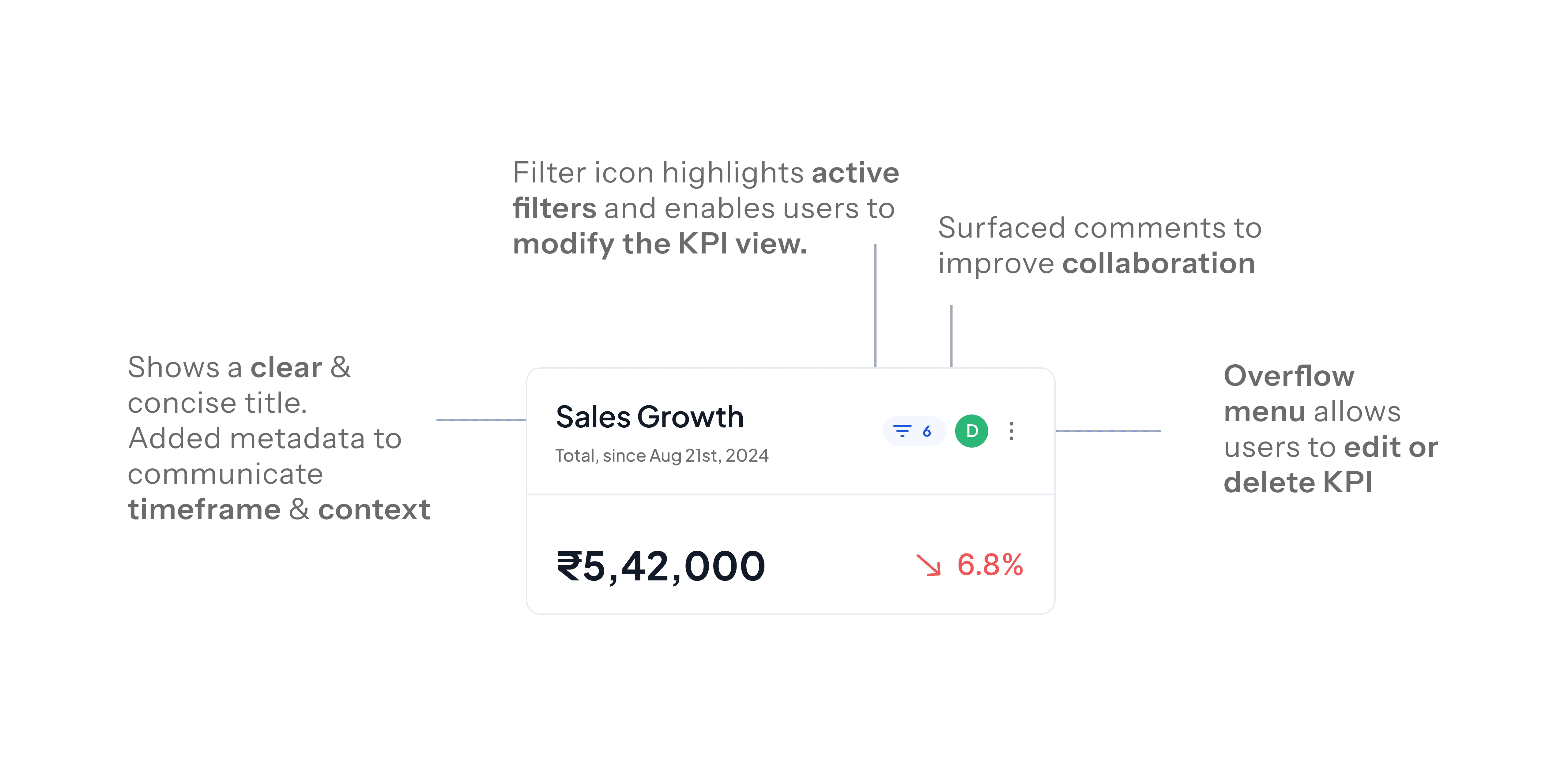
> KPI CARD GRID
A concise set of high-impact KPIs serves as the dashboard’s headline.
This layer answers “How are we doing today?”
Designed for instant interpretability with no more than 6–8 KPIs. Users can reorder KPIs with drag-and-drop to set their own priorities.
Final Design
Iterations
Before
> TABS AND FILTERS
Users stay on one screen instead of navigating multiple pages to filter same data.
Enterprises switch contexts frequently. These controls allows switching categories, Segment filtering, Changing date ranges, Toggling view types.
Final Design
Iterations
Before

HANDLING EDGE CASES, SCALABILITY & ACCESSIBILITY
Users stay on one screen instead of navigating multiple pages to filter same data.
Enterprises switch contexts frequently. These controls allows switching categories, Segment filtering, Changing date ranges, Toggling view types.
Final Design
Iterations
Before
IMPACT & OUTCOME


Here’s to simple things
done thoughtfully
bhairaviiandhare@gmail.com
Resume
2025
Bhairavi Andhare
Brewed with calm and lots of chai